Description of 2 Typefaces
1.Garamond
Garamond was named after the French type designer Claude Garamond. This Serif font emerged in the 1540s and is well-known for having marked a final transition from gothic letters to the roman alphabet.
Simon Garfield, author of 'Just My Type', describes Garamond in the following words: '[its] alphabet is full of contrast and movement but with a precision of line and elegant serifs...respectable yet warm'(Garfield, 2010, p98).
Garamond fonts are very legible, and therefore often used for printing body text and books.
Below are some uses of the Garamond font:
The famous Hunger Games trilogy books
The Harry Potter books (US versions)
The Abercrombie & Fitch logo
Release of Apple Macintosh in 1984
Neutrogena products
Kinfolk, a lifestyle magazine
2. Frutiger
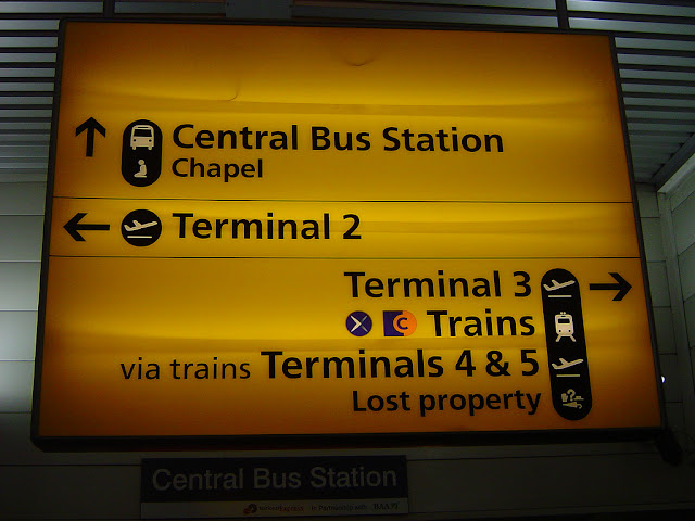
Frutiger was created by Swiss designer Adrian Frutiger in the early 1970s, initially for the Roissy Airport (now Paris Charles de Gaulle) in France. Frutiger - a SanSerif font - is believed by many to be the finest type ever for signs and directions. It is clear and very legible at a distance or for small text sizes. Frutiger himself declared that 'when it is good design, the reader has to feel comfortable because the letter is both banal and beautiful'(Garfield, 2010, p.145).
Most of Europe has adopted Frutiger, and it is seen mainly in large institutions such as universities.
Some uses of Frutiger include:
Swiss passports!! Hehe
Evian water
Swiss road signs
Heathrow Airport signs


No comments:
Post a Comment